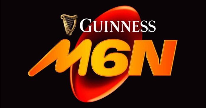
Rugby fans are united in their disdain for the new logo for the men’s Six Nations tournament, labelling it ‘horrible’, ‘awful’ and ‘the ugliest thing I’ve ever seen’.
The Six Nations unveiled their radical new logo over the weekend, in their first major rebrand since 2003.
In a complete re-design, they’ve ditched the classic rugby ball shaped like a number six, featuring the colours of the competing nations – England, Scotland, Wales, Ireland, France and Italy.
In its place is some large, orange text reading ‘M6N’, with each letter in a different font, and a red rugby ball in the background.
Explaining the new logo, a Six Nations press release explained it hoped to: ‘Signpost rugby to a younger audience.
‘Connecting its rich heritage with the modern game, and articulated through a distinctive and bold new brand, it is designed to resonate with everyone from new and existing fans to the players and unions competing in this iconic Championship.
‘The bold visual designs reflect today’s game and how fans feel about the sport and specifically, the Men’s Six Nations experience.’

Moreover, the ‘distinctive orange colour, informed by research’ represented ‘the optimism fans feel when they come together at the end of winter to experience the Six Nations together’.
Fans however are not impressed at all, with the new logo universally panned across social media, with one on Twitter calling it: ‘The ugliest thing I’ve ever seen,’ while another wrote: ‘If I were Guinness, I’d want my money back.’
Another posted: ‘This is horrible! The previous logo was so classy and reflected the history of the competition. It’s like to co-opted the team who have redesigned Jaguar to do this.’

Many were quick to liken the bright orange colour and bizarre font choice to other brands including CBeebies, Space Jam, Mars Bars, Looney Tunes and Crash Bandicoot.
Others were just infuriated at how cheap the re-design looked, with one fan writing: ‘I’m not saying rugby is hiring really s**t graphic designers but there’s a Women’s World Cup and a Six Nations next year and THIS is how the sport is marketing them? It’s almost like amateur work.’
‘Absolutely shocking. You guys have done this on Microsoft paint haven’t you?’ another fan said in agreement, while some were left in disbelief: ‘Someone was actually paid to come up with that?’
Love it or hate it, the new logo will be on full display when the 2025 Six Nations gets underway on the January 31, with France taking on Wales in Paris.
For more stories like this, check our sport page.
Follow Metro Sport for the latest news on
Facebook, Twitter and Instagram.
MORE: Don’t let England’s struggles overshadow an awfully entertaining autumn of rugby
MORE: Steve Borthwick seems no closer to solving England’s identity crisis
MORE: England can end autumn losing streak by bashing Eddie Jones’ Japan
Share your story or advertise with us: Whatsapp: +2347068606071 Email: info@newspotng.com


